by Chris | Oct 1, 2011 | Geospatial
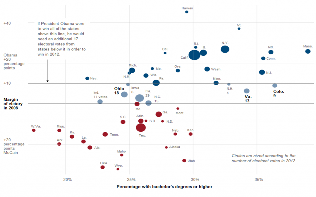
The NYTimes has just released a chart placing all electoral votes from 2008 within their respective Dem or Rep positions. The chart also displays these perspectives with regard to % of Bachelor’s Degrees per state. Interestingly, the states with the most...
Recent Comments